Brocelle Bakery
Designing and building a responsive bakery website using HTML and CSS
Timeline
Fall 2024
Team
Solomiya Ohirko
My Role
UX DEsigner and Developer
Tools
Figma, Brand Design, CSS and HTML
THE OVERVIEW:A Sweet Digital Experience
This project focused on building a responsive and user-friendly website for a bakery shop using HTML and CSS.
🔹 Target Audience – Designed for adults looking to explore the menu, find contact information, or order a cake.
🔹 Project Goal – Create a visually appealing, easy-to-navigate website that delivers essential information efficiently.
🔹 Seamless Experience – Ensured responsiveness across all devices, allowing users to access the site smoothly from desktops, tablets, and mobile phones.
This website was crafted to offer a delightful browsing experience while reflecting the warmth and charm of a bakery. 🍪✨
MY GOAL: A Seamless & Inviting Bakery Website
My goal was to create a responsive website that adapts smoothly across desktop, tablet, and mobile, ensuring easy access on any device.
🔹 Effortless Navigation – A simple, intuitive layout that helps users find information, view the menu, and place orders without hassle.
🔹 Warm & Inviting Design – Aesthetic choices, including cohesive colors, fonts, and imagery, were carefully selected to reflect the quality and charm of the bakery.
🔹 User-Centered Experience – Prioritized clarity and functionality, making the website both beautiful and practical for all visitors.
But I also faced some challenges👇
⚠️ Challenges Faced
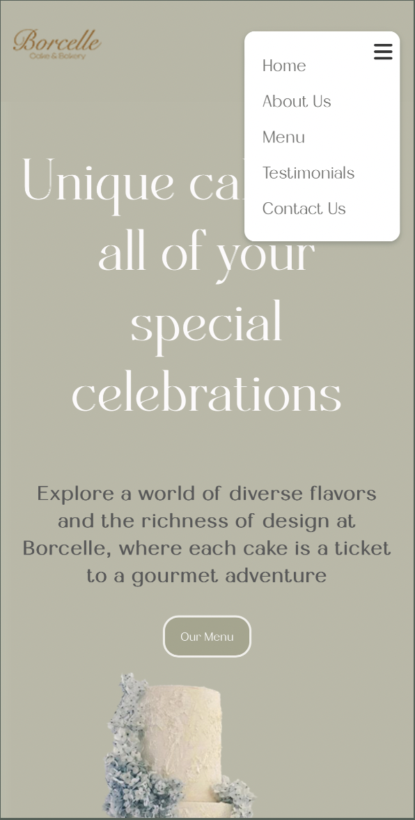
One of the biggest challenges was designing a navigation bar that adapts seamlessly across desktop, tablet, and mobile views.
🔹 Ensuring responsiveness – The navigation needed to remain intuitive and functional, regardless of screen size.
🔹 Balancing design & usability – Keeping it visually appealing while ensuring easy access to key pages.
🔹 Testing & refining – Multiple iterations were needed to fine-tune breakpoints and optimize the user experience.
💡 Finding the Solution
To tackle the navigation bar responsiveness challenge, I explored various responsive design techniques and took a mobile-first approach, scaling up from smaller screens.
🔹 Implemented Media Queries – Adjusted styling based on different screen sizes.
🔹 Used Flexible Units – Ensured elements resized proportionally for a smooth layout.
🔹 Added a Collapsible Hamburger Menu – Made navigation compact and user-friendly on smaller devices.
Here is My Process:
Crafting a Sweet Brand Identity
For my bakery website project, I carefully curated a soft, pastel color scheme to create a welcoming and gentle aesthetic, capturing the warmth and charm of a bakery.
🔹 Colors: Pastel tones enhance the inviting and comforting feel.
🔹 Custom Logo Design: A unique handcrafted logo reinforces the bakery’s brand identity, making it feel both professional and personal.
🔹 Typography:
Dealoras – Used for headings, adding a modern and eye-catching appeal.
Diamend – Applied to smaller text, ensuring readability with an elegant touch.
Sketching the Vision: Responsive Layouts
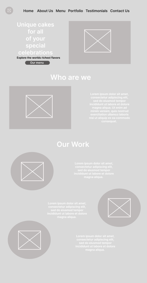
In my Figma sketches, I designed three responsive layouts for the homepage, ensuring the website adapts smoothly across large, medium, and small screens.
🔹 Large Screens – Spacious layout with clear navigation and well-structured content.
🔹 Medium Screens – Consolidated elements to fit comfortably without crowding.
🔹 Small Screens – Simplified design focusing on easy readability and accessibility for mobile users.
By tailoring each layout to its specific screen size, I ensured that the homepage remained intuitive, visually balanced, and user-friendly across all devices. 📱💻✨
Small screen
Medium screen
Large screen

FINAL DESIGN
FINAL DESIGN
Evolving for a Better Experience
As I refined my design, I made key improvements that deviated from the original prototype to enhance visual appeal and usability.
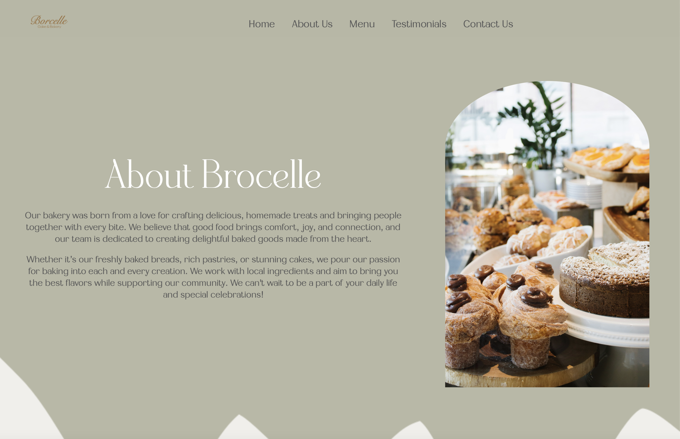
🔹 Switched from Rounded to Arched Images – Achieved a more refined and stylish aesthetic.
🔹 Added Wave Elements to the Background – Introduced a unique, engaging touch that enhances the site’s flow.
🔹 Focused on Visual Balance – Ensured the design remained clean, modern, and captivating.
These adjustments made the final design more polished and immersive, creating an inviting experience for users.
👉 Check out the website below! ✨
Now, Let’s Dive into the Details of the Design👇
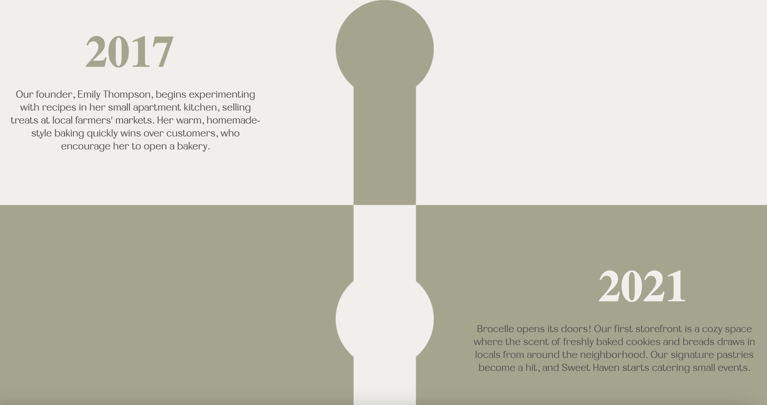
To make the website more personal and engaging, I added:
🔹 A Founder’s Section – Introducing the person behind the bakery, adding a human touch.
🔹 A Timeline of the Bakery’s History – Showcasing the journey and milestones of the business.
Sharing the story behind the brand helps build trust with customers and creates a deeper emotional connection, making the bakery feel more relatable and inviting. 🍞✨
To enhance the user experience and drive sales, I added the bakery's best-selling items to the homepage.
🔹 Quick & Easy Access – Customers can instantly see the most popular treats.
🔹 Seamless Ordering – A "Order Now" button redirects users to the Contact Us page to place an order.
🔹 Business Growth – This simple addition streamlines the ordering process while helping the bakery boost sales.
To help customers quickly explore their options, I added:
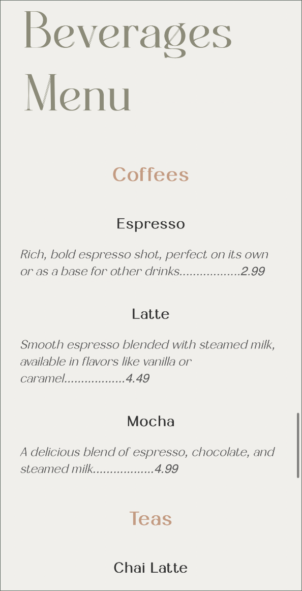
🔹 A Full Menu with Prices – Allows users to instantly see what’s available and make decisions faster.
🔹 High-Quality Images – Showcases products in a visually appealing way, making them more enticing.
🔹 A Quick-Access Button – Redirects customers to the Contact Us page for easy access to the bakery’s location and phone number.
What I Learned
This project helped me sharpen my skills in CSS and HTML, especially in responsive design.
🔹 Improved Responsiveness – I gained hands-on experience in ensuring layouts adapt smoothly across all devices.
🔹 Bridging Design & Code – I realized how essential it is for designers to understand code, making designs more practical and adaptable.
🔹 User-Centered Approach – This insight has made my work more versatile, functional, and user-friendly.
Next Steps: Taking the Design Even Further
Moving forward, I aim to enhance the website even more by:
🔹 Refining Visual Elements – Polishing the design for an even more cohesive and appealing look.
🔹 Exploring Interactive Features – Adding subtle animations and effects to improve engagement.
🔹 Optimizing Performance – Ensuring the site runs smoothly and efficiently across all devices..

