
Ventra Redesign
Redesign of Ventra app map function
Timeline
Spring 2024
My Role
UI/UX Designer
Tools
Figma, User Interface Design, Logo Design, Branding Design
Team
Solomiya Ohirko

THE PROBLEM: Why Ventra Needs a Redesign
Rushing to catch a train, you open the Ventra app—but instead of a quick route check, you're stuck navigating a cluttered, confusing interface. Frustrating? You're not alone.
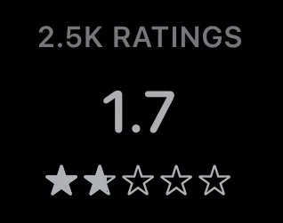
With a 1.7-star rating, Ventra has become a daily struggle for thousands of Chicago commuters. It’s meant to simplify transit, yet it often does the opposite.

MY GOAL?
To untangle the mess and give commuters a map that actually guides them—not confuses them. A transit app should feel like a helping hand, not a puzzle you have to solve while your train speeds away.🧩

Here’s How I Did It
Before diving into the redesign, I teamed up with a group to research and evaluate the Ventra app in a separate project.
Through usability testing, heuristic evaluations, and user interviews, we uncovered key pain points that made navigation a struggle. These insights became the foundation for my redesign, ensuring that every change was backed by real user needs.
Here is what we found:
-

Warning Icon Confusion⚠️
During our Ventra Research and Evaluation, we found that only 2 out of 6 participants understood the meaning of the warning icon. This means the icon fails to communicate important information, leaving most users confused
A warning should grab attention, not be a guessing game.
-

Lost in the Live Route📍
During usability testing, 3 out of 5 participants had no idea what a Live Route was or where to find it. If users can’t locate a key feature, it might as well not exist!
This highlights a major discoverability issue, making real-time navigation harder than it should be.
-
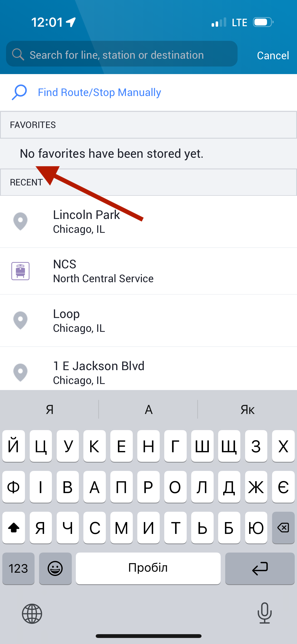
Lost in Favorites⭐
The Favorites option is only visible in the search bar and home page, making it hard to find on the main map screen. This inconsistency leaves users frustrated and searching for a feature that should be easily accessible.
A favorite feature should feel effortless—not like a hidden treasure hunt.
-
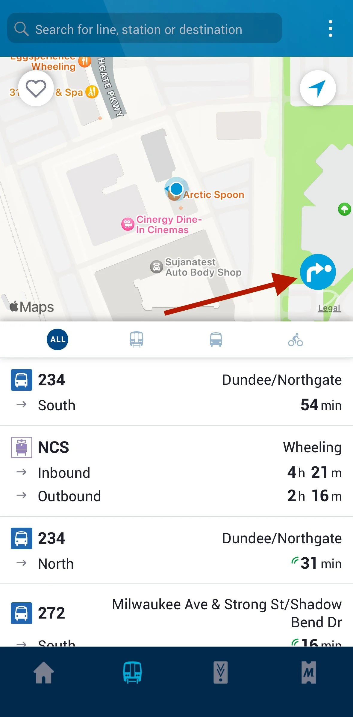
Misleading Icon 🔀
During usability testing, 3 out of 5 users did not click on the route icon as instructed. Why? Because they didn’t realize it was linked to route options!
This confusion meant users missed out on key navigation features, proving that an icon is only useful if its meaning is clear at first glance.
Here is my Design Process:
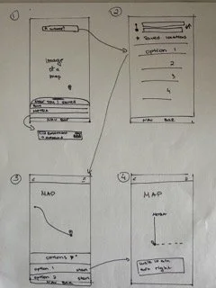
From Inspiration to Refinement
My design journey began with inspiration, drawing ideas from existing apps like Mootive, which helped shape the core concept of my application.
🔹 Sketching & Iteration – I started with rough sketches but made significant changes along the way, such as:
Redesigning the search field to keep it consistent across all pages.
Adjusting the input fields based on real-world examples to ensure clarity and usability.
🔹 Comparing & Testing – As I neared completion, I tested my prototype on the Figma mobile app and compared it side by side with Mootive.
Font adjustments – I realized my fonts appeared too large on an actual screen.
Navigation improvements – The top bar and nav bar were too small, making it difficult for users to tap, so I resized them for better accessibility
User Testing: Evaluating the Ventra Redesign
To assess the usability of my Ventra redesign, I tested the prototype with three frequent Ventra users who regularly rely on the system. Each participant was asked to perform key tasks while thinking out loud, allowing me to observe their navigation patterns, pain points, and overall experience.
✅ All users successfully completed the tasks, confirming that the design was intuitive and functional.
✅ Participants praised the level of detail and found the new features highly beneficial.
However, testing revealed two key areas for improvement:
❌ Confusion about the “Live” feature – Users questioned why some routes had a blinking light while others didn’t.
❌ Font contrast issues – One user noted that certain fonts appeared too light, making them harder to read.

User Feedback & Design Adjustments
Based on these insights, I made targeted refinements to improve clarity and accessibility:
✔ Enhanced Readability – Adjusted fonts to be larger, bolder, and darker, ensuring better contrast for improved legibility.
✔ Refined “Live” Icon Display –
Moved the “Live” feature to the left side of the timing for better visibility.
Applied the live icon to all transportation methods—routes without real-time tracking now have a grey icon instead of green, making the distinction clearer.
Here is what I improved
🔧What I Changed
✅ Modernized the Ventra app with a sleek, darker color scheme and a new font for a more elegant and refined look.
✅ Separated "Favorites" from "Near You" to enhance accessibility and reduce clutter, making it easier for users to find what they need.
✅ Added clear transportation identifiers by incorporating Metra, CTA, and Pace logos near transportation options for instant recognition.
✅ Implemented user feedback from our Ventra Research by:
🚦 Adding icons to show busyness levels at stations.
🔴 Making the "Live" function blink to clearly indicate activity.
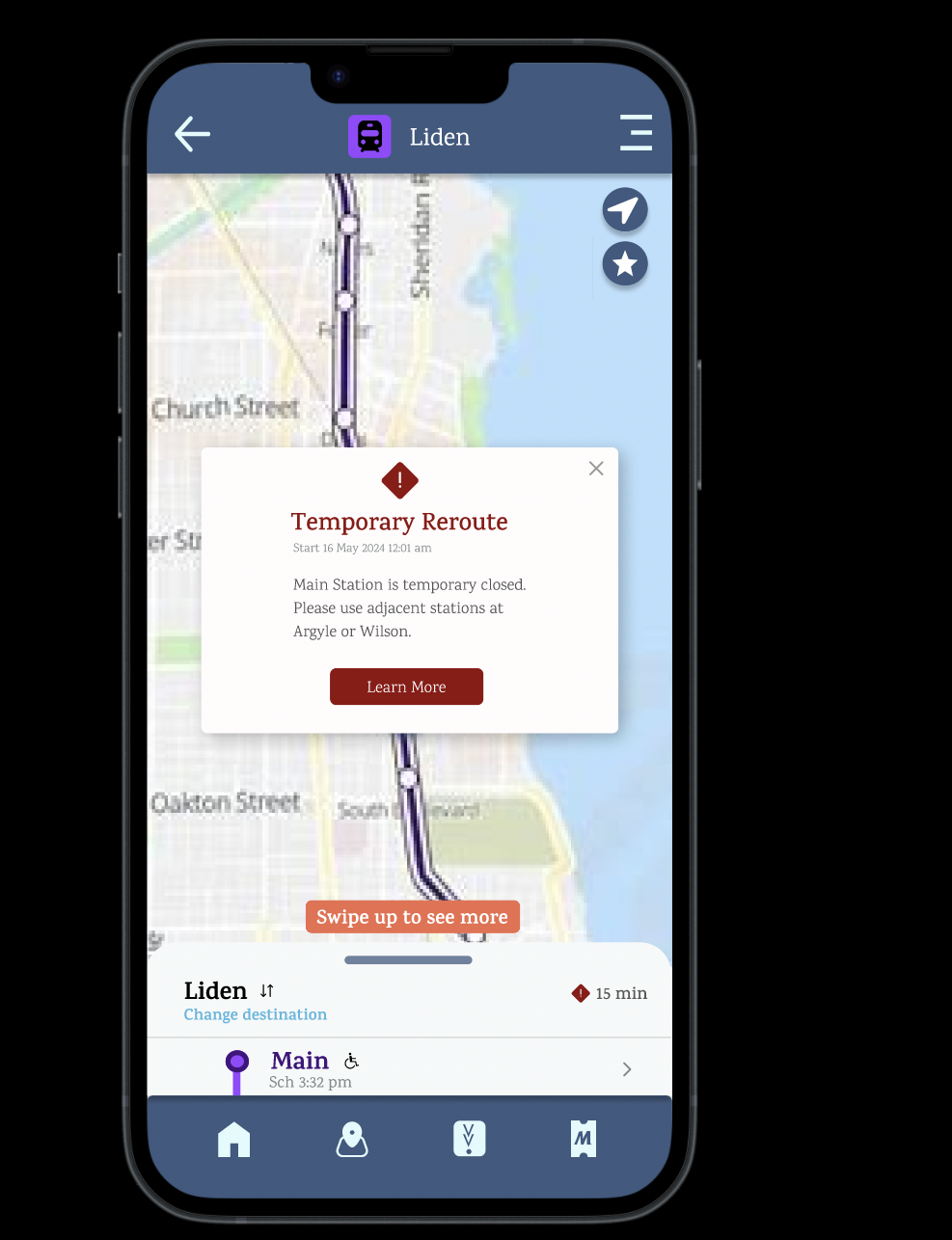
⚠️ Changing the warning icon from blue to red for greater visibility and urgency.
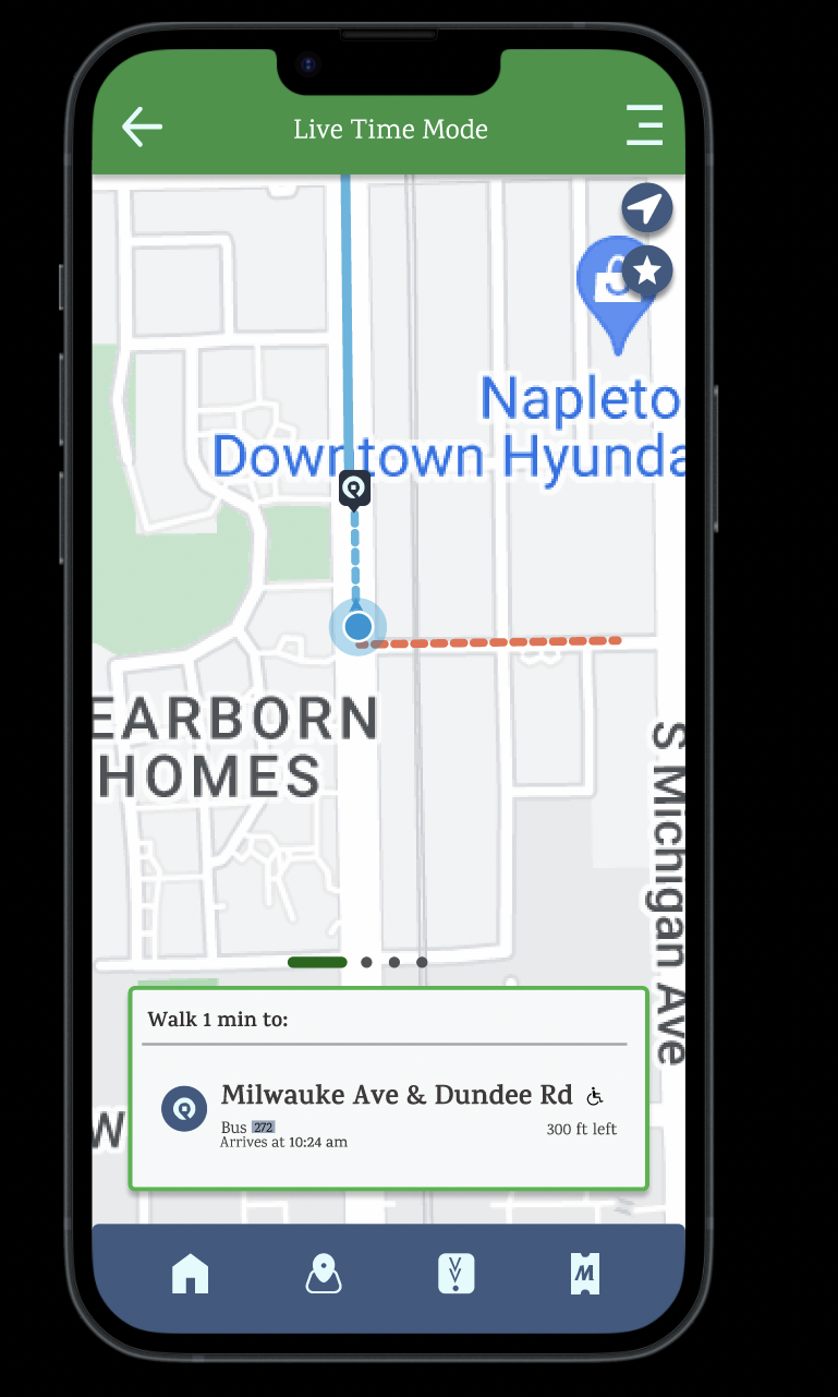
⭐️Introducing Live-Time Mode
I added a Live-Time Mode feature that allows users to enable location tracking while following a route.
🔹 Step-by-step guidance ensures users stay on track.
🔹 Real-time navigation helps commuters travel with ease and confidence.
🔹 Location tracking provides instant updates, making the journey smoother.

⚠️Enhanced Warning System for Better Accessibility
To prevent errors and improve accessibility, I implemented a full-screen warning sign when users search for a route with potential issues.
🔹 Users can click "Learn More" for additional details or dismiss the notification if they choose.
🔹 Ensures critical information isn’t missed, improving awareness and decision-making.
🔹 Provides a clearer, more accessible way to alert users about disruptions that may impact their travel experience.
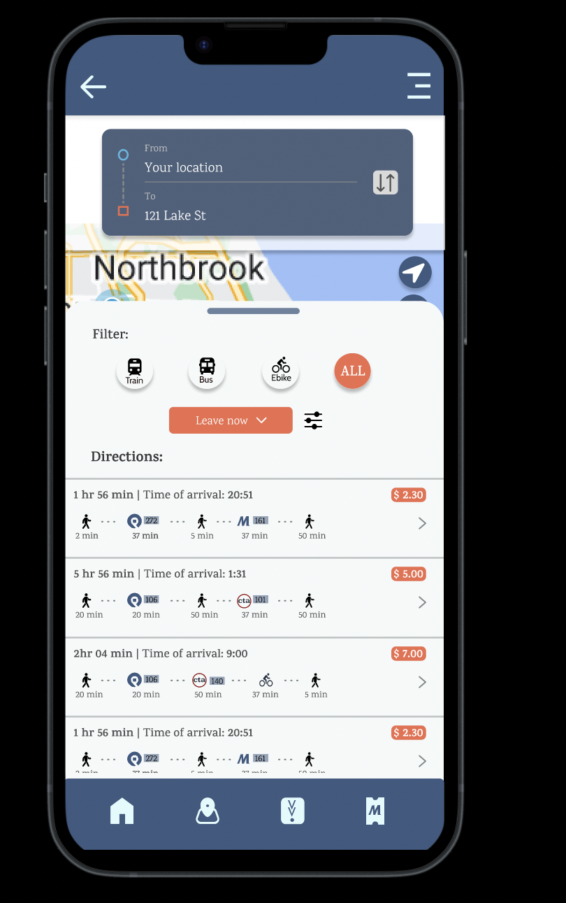
💰 Smarter Route Selection
Now, when selecting a direction, users can see the cost associated with each route upfront.
🔹 Filter options by time, transportation method, and cost for a personalized travel experience.
🔹 Enhanced usability by giving users more control over their journey.
🔹 Added orange elements for contrast and visual interest, improving readability and engagement.

FINAL PROTOTYPE
FINAL PROTOTYPE
Now It’s Your Turn!
Go ahead—play around with the final prototype!
What I Learned
This process reinforced the power of user feedback in shaping meaningful design. I learned that complex features must be intuitive and directly informed by real user experiences.
🔹 Listening to users helped me understand their true needs and frustrations.
🔹 Functionality matters—a great design isn’t just about looks, but how well it works for people.
🔹 Iteration is key—refining based on feedback ensures a product that’s both practical and user-centered.
Next Steps
Up next: a full Ventra app redesign! 🎉
I’m taking everything I’ve learned—user feedback, usability insights, and modern design principles—to create a more intuitive, seamless experience. My focus will be on:
🔹 Enhancing usability with a smoother, more user-friendly interface.
🔹 Refining navigation to make trip planning effortless.
🔹 Integrating features seamlessly for a more cohesive experience.