Ventra Research and Evaluation
Timeline
Winter 2024
Team
Solomiya Ohirko, Matthew Clifford, Samuel Seon
My Role
UX Researcher
Tools
Group work, Interview process, Heuristic Evaluation, Cognitive Walkthrough, Personas, Task analysis, Affinity Diagram.
THE PROBLEM: A Frustrating Ride Before the Ride
“There was absolutely no thought made into the creation of this horrible app”
- Ventra app review on the Apple store
Imagine you're running late for the train. You grab your phone to reload your Ventra card, but the app? It’s confusing, slow, and anything but intuitive. You tap through menus, struggle to find the right option, and suddenly, the train you were rushing for is already gone!
I set out to understand why this experience felt so frustrating for users and what could be done to make it better.
THE GOAL: Understanding the User Struggles
To get to the root of the problem, I took a deep dive into user behavior and pain points through:
✅ Heuristic Evaluation – Identifying usability roadblocks.
✅ Cognitive Walkthroughs – Stepping into the user’s shoes to experience their struggles firsthand.
✅ User Interviews – Hearing directly from real commuters about their frustrations.
What We Discovered:
💳 Adding funds was confusing – Users struggled to find the right option.
🚆 Trip planning felt hidden – Essential features weren’t easy to access.
📍 Navigation was frustrating – Key station info wasn’t where users expected it.
It became clear: Ventra wasn’t just a transit app—it was a usability test waiting to happen.
👤❌❌❌❌
4 OUT OF 5 USERS
Were lost before they even started their journey - because they couldn’t find the live route.
👤⌛️
1 MINUTE AND 48 SECONDS
That’s how long it took users to find a route (feels like forever when you’re late for the train)
👤👤❌❌❌
3 OUT OF 5 USERS
Users did not click on the route icon- not because they missed it, but because they misunderstood what it meant.
Let’s Explore the Process Step by Step:
Cognitive Walkthrough & Heuristic Evaluation
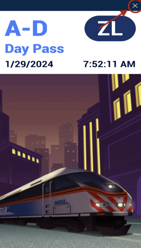
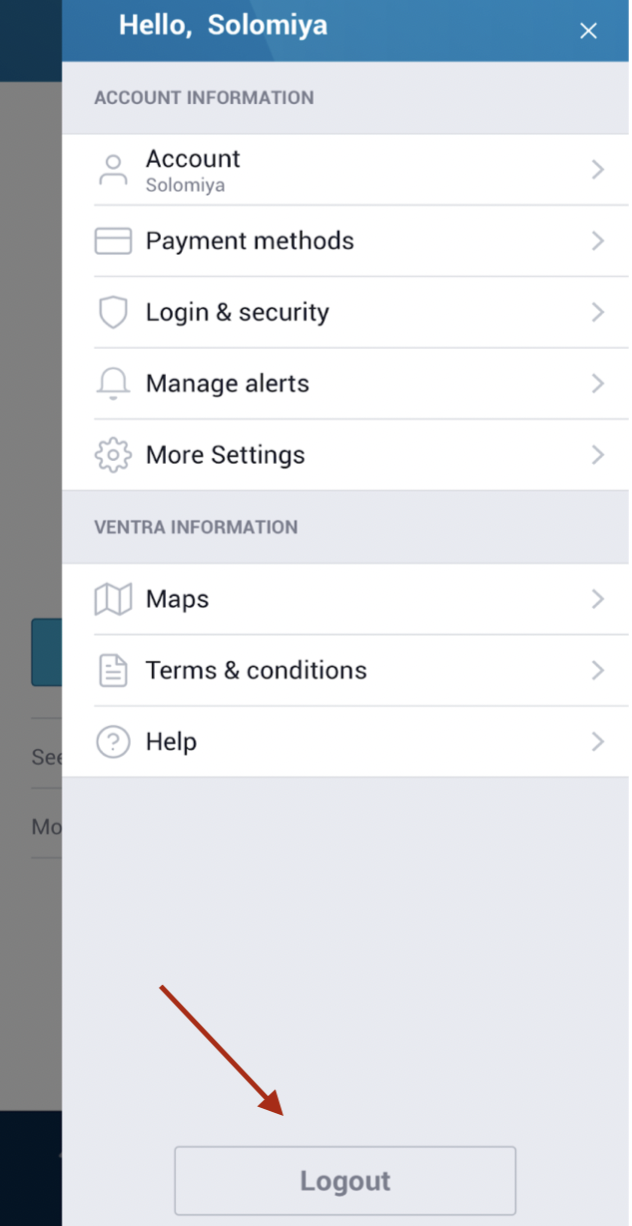
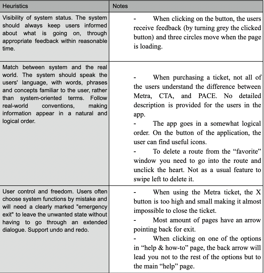
To assess the Ventra app’s usability, my team and I conducted a heuristic evaluation and cognitive walkthrough. We analyzed everything—from buying a Metra ticket to navigating FAQs—to uncover key usability issues.
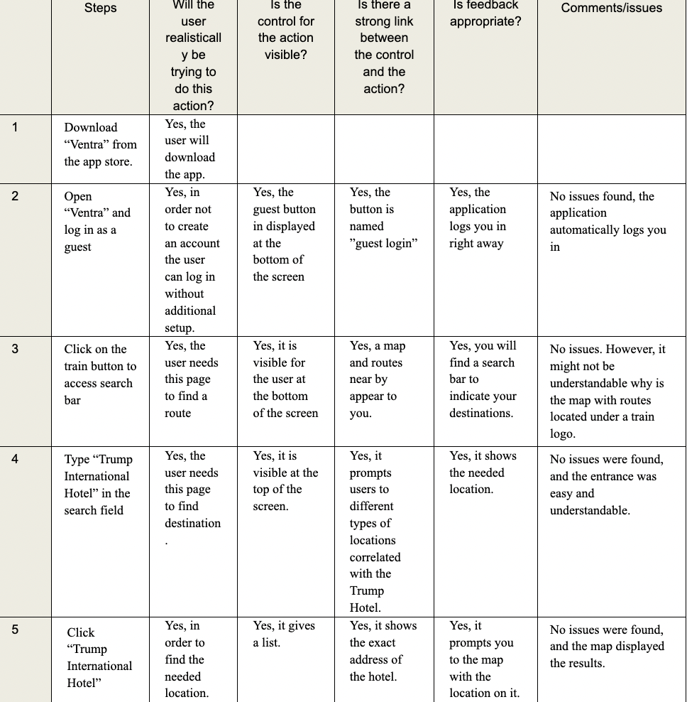
Cognitive Walkthrough
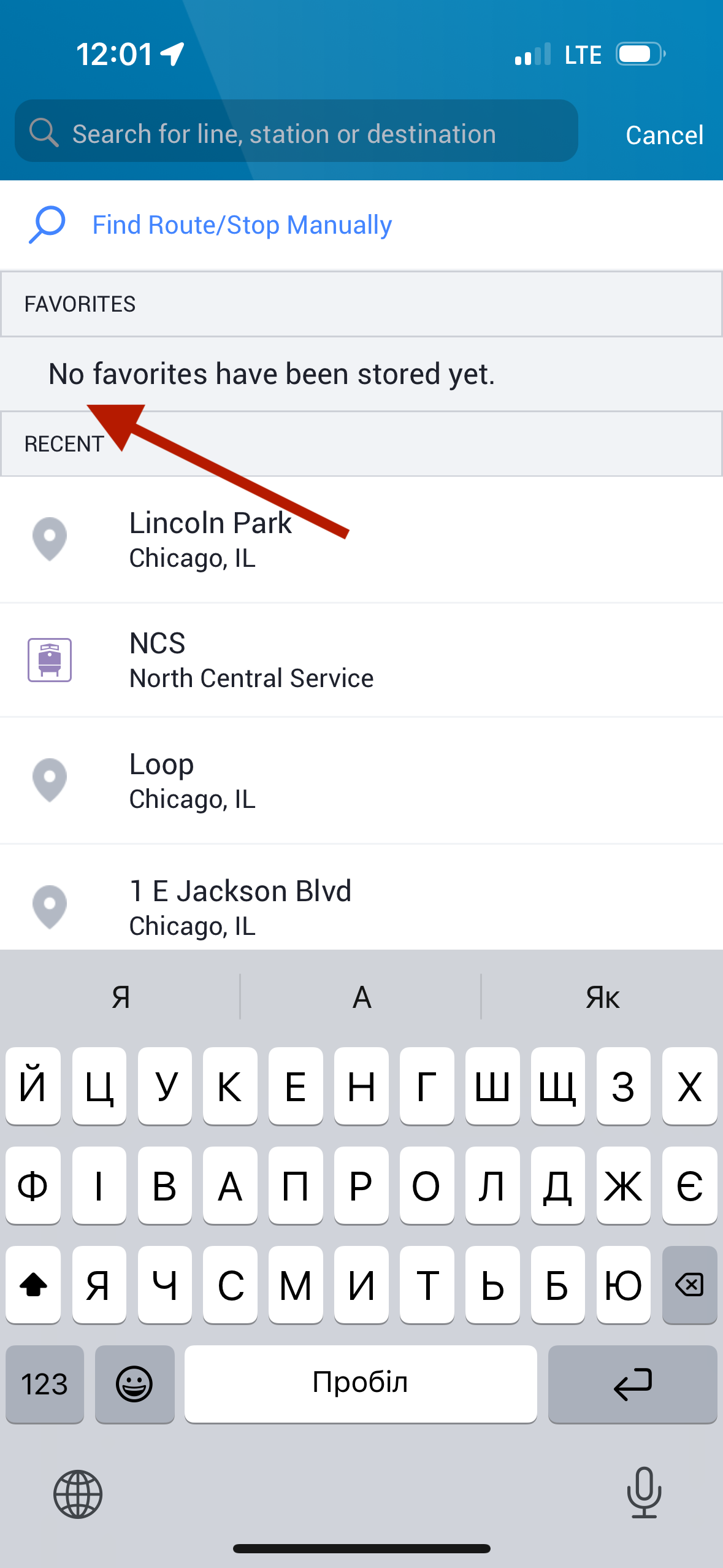
We evaluated how users find a route from O'Hare Airport to Trump International Hotel via CTA, analyzing user control and feedback at each step. This step-by-step assessment revealed how effectively the app guides users through public transit navigation.
Scenario: You just arrived at O’Hare airport and you need to find a correct route to Trump International Hotel in Chicago via CTA public transportation.
Data Analysis
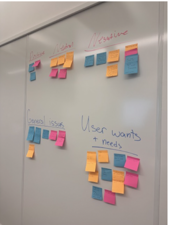
After the interviews, we categorized responses using Post-It notes, sorting feedback into:
🔹 User Needs & Wants – Features users desired or expected.
🔹 Positive Feedback – What worked well.
🔹 Negative Feedback – Usability frustrations and pain points.
🔹 Neutral Observations – Features that didn’t strongly impact the experience.
🔹 General Issues – Broader concerns affecting usability.
This approach helped us identify key patterns and usability gaps, shaping our final insights.
Heuristic Evaluation
Using established usability principles, my team of six experts conducted a systematic evaluation of the Ventra app. We assessed key areas like system feedback, real-world match, user control, and error prevention—from purchasing Metra tickets to navigating FAQs. Our findings highlighted critical usability issues and opportunities for improvement.
User Interviews
We interviewed six participants, primarily college students from freshman to senior year, all frequent public transit users. To ensure relevant insights, we selected individuals who actively rely on the Ventra app. Each participant provided consent before interviews, which were conducted in person or online.
Dimensions & Personas
From our interviews, we identified two distinct user patterns:
🔹 Frequent Users (Users 1 & 5) – Regular public transit riders who had mostly positive experiences with Ventra and encountered only a few bugs.
🔹 Infrequent Users (Users 2, 3 & 6) – Used public transit less often and reported more bugs and negative experiences with the app.
Defining these user dimensions helped us align our evaluations with organizational goals and usability improvements.
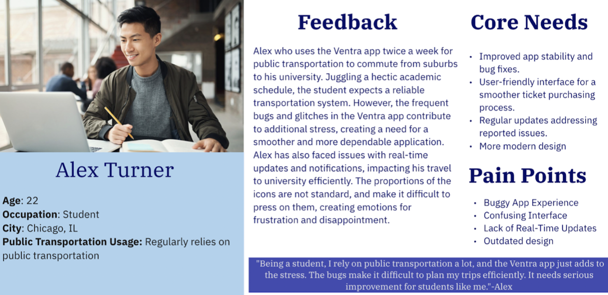
Meet the Personas
-
Scenario :Alex a college student, is in a hurry for his final exam and decides to use the Ventra app to purchase a Metra ticket. When Alex is in the middle of choosing his ticket option, the app glitches and asks him to resign in. Unfortunately, Alex had forgotten his password and proceeded to create a new one with frustration. Being stressed out from his finals Alex finally purchases the ticket and arrives at the station. He was even more shocked when he heard at the station that his train is delayed for 20 minutes, but he never received a notification from the Ventra app. Now will Alex make it for the exam on time?
Despite facing these challenges, Alex remains committed to using public transportation and the Ventra app for its convenience, hoping for improvements in the user experience.
-
Scenario:Jessica works at a company in downtown Chicago as a Software Engineer. Committed to sustainability and efficiency, she chose public transportation as her primary mode of commuting. Therefore, she uses the Ventra app on her everyday trips. Not to worry about the money on the card, Jessica set up an autopayment renewal for 20 dollars. Making her interaction with the Ventra app more seamless and more reliable.
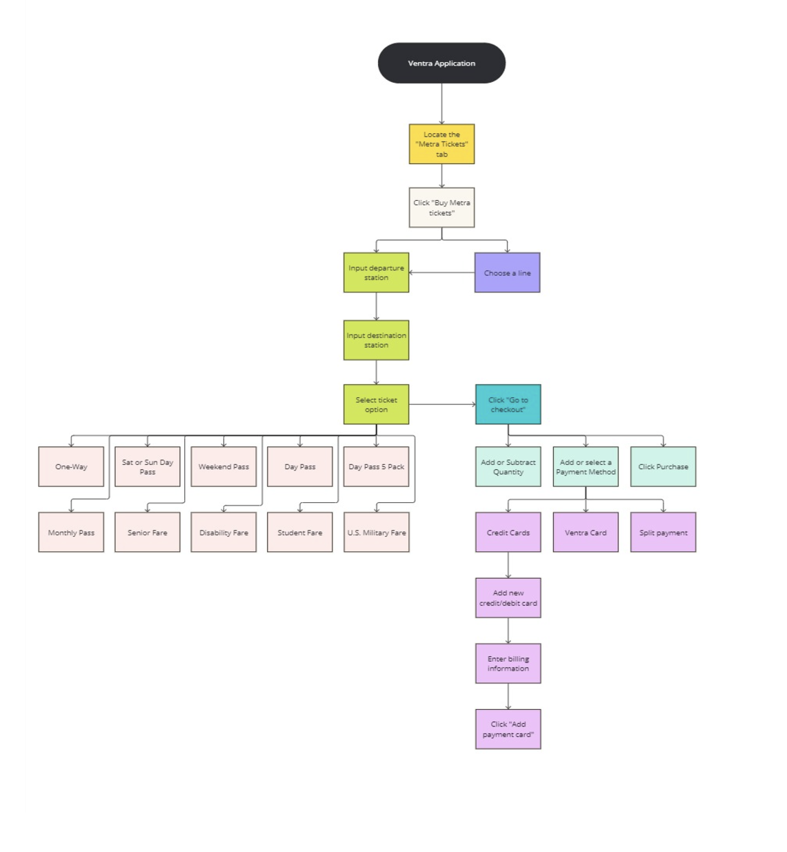
Task Analysis
We analyzed the process of purchasing a Metra ticket through the Ventra app. While it initially appears step-heavy, the process becomes more streamlined after the first use, as users can save or favorite items.
Our interviewees had mixed opinions:
🔹 Some found the process easy and straightforward.
🔹 Others encountered glitches and usability issues, making it frustrating.
These insights highlight the need for a smoother, more reliable ticketing experience.
Usability Testing
Usability testing is essential for assessing the Ventra app’s effectiveness, efficiency, and user satisfaction—especially as public transit becomes more digital.
Our testing plan focused on identifying usability issues by tracking:
🔹 Errors & Frustrations – Where users struggled.
🔹 Task Completion Times – How quickly actions were completed.
🔹 User Satisfaction – Overall experience and ease of use.
These insights help ensure the app aligns with organizational goals and delivers a smoother user experience.
Procedure
We tested five participants, all pre-screened through a questionnaire to ensure they fit the Ventra app’s target user base.
🔹 Introduction – Participants were invited, briefed on the study, and informed about data usage.
🔹 Consent – Each participant signed a consent form before testing began.
🔹 Task Execution – Users completed a series of tasks related to different Ventra app features, while being observed and recorded.
🔹 Wrap-Up – After testing, we conducted final survey questions to gather additional insights.
This structured approach helped us identify key usability issues and user pain points.
User Tasks:
-
“You wake up and want to start your day with a bike ride. Find a bike station near you with bikes available for service and for rent. Please let me know when you think you have finished the task.”
Objective: Can a user easily find a bike station with bikes available for service and for rent?
Positives:
All of them managed to finish the task and understand the iconography even if it took them a bit of time to figure out the location of the actual bike tab.
Recommendations:
We recommend adding the bike stations to the “All” tab as it could help the user find the initial station they would like to rent from. The next step would be to create a seamless transition from the Divvy app or its features from the Ventra app. The current design adds time and makes finding a bike through the Ventra app a task not worthwhile within the system.
Quotes from users:
“It could be a lot clearer”
“I wish it would show me a route to the bike”
-
“After your morning bike ride, you want to go and visit a friend who lives in Naperville. Your task is to find a route from your current location towards the closest Metra station.”
Objective: Can a user easily find a route?
Positives:
Participant number 5, who knows what a live route feature is, indicated that this feature saves a lot of time for them. In addition, the candidate mentioned that green is a great indicator for this icon since it is a universal color of “live”. The participant number 2, overall adored the function of the app of displaying the map and current location with transportation near you.
Recomendations:
We recommended that the application provide clearer labeling or tooltips for icons to improve user understanding. For example, for the “route icon”, it is recommended to change to a more universal icon and display it closer to the search field for the users to notice. Educate users about key features, such as the "Live Route" icon, and how to use them effectively. It is beneficial to consider incorporating visual cues or tutorials to introduce users to new features or icons within the system.
Quotes from users:
“What is a live route?”
“Never knew they had this feature..” (referring to the live route question)
“The route icon didn't stand out to me. I didn't realize I was supposed to click on it." ( referring to route icon)
“I love how it shows my location on the map”
-
“Along your way you are trying to board the CTA to Union Station, however you don’t have a balance on your card. Add funds to your card.”
Objective: Can users easily add funds to their CTA card?
Positives:
All users reported finding this task to be extremely easy to understand and execute. All users were easily able to identify where to go in the app in order to add funds to their card and they all felt completely satisfied with their experience in doing so.
Recommendations:
Due to the universally positive feedback, no specific recommendations were noted.
Quotes from users:
"Well, that is easy"
-
“Now that you have arrived at Union Station you must buy a one-way student ticket from Union Station to Naperville.”
Objective: Can a user easily buy a one-way student ticket from Union Station to Naperville?
Positives:
When the user knows which line goes to which locations or notices the Departure/destination station search the system works flawlessly to give the user the appropriate ticket. Users 1 and 2 had no trouble with the process as they were able to identify these parts of the user interface. The process of purchasing and inputting purchasing information works without issues.
Recommendations:
Our main recommendation is to enlarge the search function that sits at the top of the Ventra app. This function can make it easy for users to type in their location and the known destination but because this function blends into the general background it is easily ignored. Or giving this section a more prominent color/contrast to allow it to pop on the page more.
Quotes from users:
“I don't know what any of the lines mean… I don’t usually use the Metra”
“It automatically switched the location from Naperville to my station”
Sorting Feedback
After testing, we analyzed user perspectives on each challenge, focusing on:
✅ Task difficulty – How easy or frustrating the process was.
✅ User confidence – Their comfort level in completing the tasks.
✅ Satisfaction – How happy they were with the experience.
✅ Completion time – How long each task took.
This helped us identify pain points and areas for improvement in the Ventra app.
⚠️ Problems Encountered & Solutions
🔹 Scheduling Conflicts – Due to scheduling conflicts, our team conducted interviews independently, ensuring each session was properly recorded and documented. As a result, we were able to test five participants instead of the planned six.
🔹 App Glitch – During one interview, the Ventra app crashed, displaying a blank white screen. We restarted the app and resumed the task, noting the issue as a critical usability flaw.
🔹 Location-Based Confusion – In one suburban interview, participants were confused when the app failed to display available bicycles, making the first task misleading. This highlighted the need for clearer location-based updates within the app.

Key Takeaways
Working on the Ventra project strengthened my skills in both UX research and collaboration.
🔹 UX Evaluation – The cognitive walkthrough and heuristic evaluation taught me how to assess usability by anticipating user behavior and identifying pain points.
🔹 User Empathy – Conducting interviews and creating personas helped me better understand diverse users, making our insights more impactful.
🔹 Collaboration & Problem-Solving – Working with a team reinforced the importance of clear communication and collective problem-solving in UX research.
This project deepened my ability to analyze, empathize, and improve user experiences.
Next Steps
Building on our research, my next goal is to redesign the Ventra app, using key insights to improve the overall user experience.
✅ Redesign in Progress – I’ve already revamped the map function in my Ventra Redesign project to enhance navigation.
✅ Feature Refinements – Next, I’ll focus on improving other app features based on usability feedback.
✅ Further Usability Testing – Additional testing rounds will help ensure these updates truly meet user needs.


